
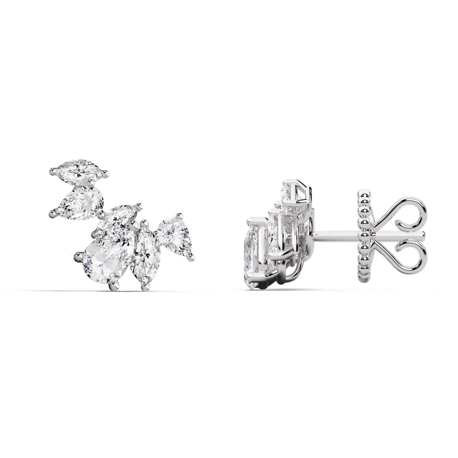
Intro: A Quick Story, A Stat, And Your Big Question
I got a text from a friend under mall lights, hands full of ring trays, asking, “Why do these look so different?” Classic jewelry pieces were spread out like a tiny museum tray, all sparkle and nerves. In my workshops, 3 out of 5 shoppers say the shape sold them, yet the cut told the truth—so how do you make the right call fast? If you’re eyeing pear cut diamonds, here’s the twist: the details that matter aren’t always obvious, especially under bright store LEDs (they can hide a lot). The bow-tie effect, the girdle, the table—these decide what you actually see at home. So, are you comparing what counts, or what dazzles for ten seconds?

Look, it’s simpler than you think, but it’s not a coin flip. We’ll break down what the eye misses, why length-to-width ratio changes the whole vibe, and how symmetry and polish grade can make or break that first-glance wow. Ready to stack the deck in your favor? Let’s move into what most advice leaves out—then we’ll look ahead.

The Hidden Snags Traditional Advice Skips
What trips buyers up?
Most guides say “check sparkle and size,” which sounds helpful until the ring looks flat at home. The real culprits? Proportions. A pear with a bloated table percentage can leak light, and a shallow pavilion depth can push brightness to the edges only. The infamous bow-tie effect isn’t just a quirk—it’s a clue to light leakage and facet alignment. If the girdle thickness is razor-thin near the tip, chips are more likely, especially in a dainty prong setting. And symmetry matters: a lopsided shoulder or off-center culet can make one side “read” heavier—funny how our eyes catch that even when we can’t name it.
There’s also the everyday fit. A length-to-width ratio that looks elegant in a photo can feel awkward on your hand. A 1.45–1.55 ratio is a classic sweet spot; go too long and the tip can snag, go too squat and it loses that graceful drop. Fluorescence can add haze in strong sunlight for some stones, and a strong blue can complicate a high color grade—context matters. Traditional tips rarely explain that the polish and symmetry grades directly affect crisp facet reflections. Invisible in the moment—huge in daily wear.
Forward-Looking: Smarter Comparisons With Modern Tools
What’s Next
Here’s the better path: compare by light, not just by vibe. New imaging methods like ASET and IdealScope show where light leaks, so you can pick the pear that returns brightness to the center, not just the shoulders. Some vendors now share ray-trace models and 3D scans; they reveal if the pavilion angles and arrows align to avoid that dark stripe. Pair that with a loupe check for a clean tip and even facet junctions, and you’re way ahead. If you’re browsing chic diamond jewelry, ask for a side-by-side report: table percentage, pavilion depth, and symmetry rating on one screen—then see the stones under soft, neutral lighting. Real life lighting wins—always.
Future-forward tools are also getting friendly. AR hand try-ons let you test spread and ratio against your finger shape; AI grading summaries translate lab data into plain speak; and fluorescence mapping shows if sunny-day color shifts will bug you—funny how that works, right? Even the setting changes the read: a slim bezel setting can guard a delicate girdle at the tip, while a V-prong offers protection with more air and fire. Compare how each setting style affects light return and snag risk. You’re not just picking a stone—you’re tuning a system of proportions, protection, and performance.
How To Choose With Confidence: Three Metrics That Matter
Advisory mode, short and sweet. One: Light performance first—prefer ASET/IdealScope images with strong central return and minimal dead zones; judge bow-tie visibility in soft light, not just under spots. Two: Proportion discipline—target a balanced length-to-width ratio (around 1.45–1.55), sensible table percentage, and a pavilion depth that doesn’t crush the center; keep girdle thickness even, not knife-edge at the tip. Three: Craft and context—excellent symmetry and polish grades, a protective V-prong or bezel at the tip, and clarity grade that keeps the facet pattern crisp without overpaying for invisible perks. Do this, and your pear won’t just look good in the case—it’ll look great in your life. For deeper comparisons and calm, data-forward picks, explore with Vivre Brilliance.